(or “Why Averages Lie”)
To wrap up our series on lying with statistics, I wanted to talk about choices.
Specifically, how to choose the right statistic.
Because it is such a common source of statistical shenanigans (either intentionally or unintentionally), it is worth discussing the art of picking the correct estimator.
How to Lie (Recap)
At risk of being repetitive, here are the 3 common ways to lie with statistics that we’ve been discussing:
- Ignoring variability
- Using a non-representative sample
- Choosing a bad estimator ← YOU ARE HERE
Today, we’ll cover what separates a good estimator from a bad one.
What is an Estimator?
An estimator simply a statistic whose purpose is to estimate something about the larger whole.
While there are many possible estimators, the most common ones should sound familiar to you already:
- The mean (average) is an estimator
- The median is an estimator
- The maximum is an estimator
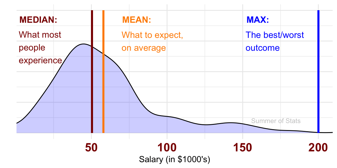
Why so many different statistical estimators? Because each of these quantities estimates a different thing:

These subtle distinctions between each estimator will have important ramifications when deciding which one to use.
What is a Bad Estimator?
A bad estimator is any estimator that fails to adequately represent the thing we want to know.
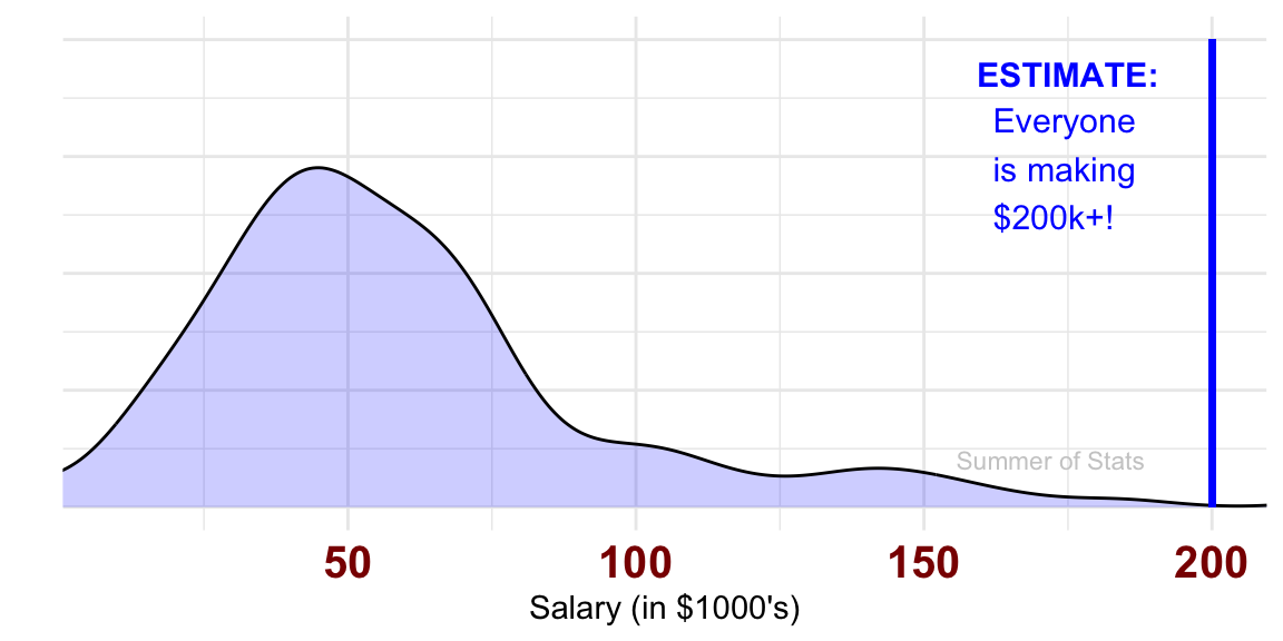
For example, if we want to estimate the earnings of a “normal” resident in Town A, we shouldn’t choose the maximum of our sample as our estimator:

While this IS a “valid” statistic, it is also a terrible estimator for the question at hand. As anyone can see, our estimate is nowhere near what most people reported earning our sample.
Not many people would be fooled by this bad statistic. However, in other cases, it may be a little trickier to spot a bad estimator, as we’ll see below.
Statistics in Daily Life
One practical lesson that you can take away is:
When using averages, be wary of outliers
In the above example, it was easy to see that the MAX is a bad estimator for what is “normal”.
However, depending on how our data looks, the average may not be a good option either…
Salary Levels, Revisited
Let’s revisit our hypothetical Town A. But, now our town is home to a famous celebrity.
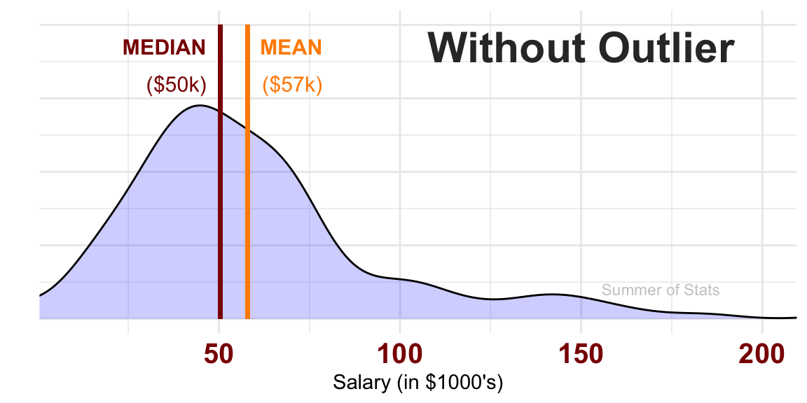
In our initial example, we saw that the mean earnings of residents was reasonably close to the median. In this case, both estimators give us a decent fix on where population earnings are for Town A.
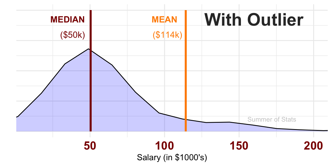
However, adding just 1 extreme outlier has very clearly shifted the average of our sample. Now our estimator (the average) doesn’t represent our population particularly well anymore:


Now, the median is clearly a much better estimator of what people typically make in Town A.
Selecting the Right Estimator
It’s important to note that the “best” estimator is always context-dependent. It all depends on the question you are trying to answer, and in some cases, the data we are working with.
The average may be your best estimator. In fact, it often is (for example, “how much does the average consumer spend?”).
But, when you have skewed data or extreme outliers, the average may not be a good estimator any more.
Summing Up
Statistics are very useful tools for understanding the world. But, just because someone picks a statistic doesn’t mean it’s the best one to use.
The estimator you use should always match the question you are trying to answer. As we saw, when you choose the wrong statistic, you may end up completely misunderstanding what your data is telling you.
BONUS: Telling a Story (with Statistics)
Because it fits so well into today’s post, I wanted wrap up with a fun dialogue from one of my favorite books growing up: The Phantom Tollbooth.
It manages to twist statistics in the most delightful ways. I hope you enjoy!
“But averages aren’t real,” objected Milo; “they’re just imaginary.”
“That may be so,” the boy agreed, “but they’re also very useful at times. For instance, if you didn’t have any money at all, but you happened to be with four other people who had ten dollars apiece, then you’d each have an average of eight dollars. Isn’t that right?”
“I guess so,” said Milo weakly.
“Well, think how much better off you’d be, just because of averages,” he explained convincingly. “And think of the poor farmer when it doesn’t rain all year: if there wasn’t an average yearly rainfall of 37 inches in this part of the country, all his crops would wither and die.”
It all sounded terribly confusing to Milo, for he had always had trouble in school with just this subject.
– The Phantom Tollbooth
Up Next: Making Decisions
Next week, we’ll shift to a new topic: how to make decisions with data.
To start, we’ll be discussing an often misinterpreted concept; statistical significance. See you then.
===========================
R code used to generate plots:
- Comparing Estimators
library(ggplot2)
library(data.table)

set.seed(071625)

### Model a right-skewed salary distribution
normal_sal <- rnorm(100,50,20)
big_sal <- rnorm(40,100,60)
all_sal <- append(normal_sal, big_sal)

# Our Estimators
sal_med <- median(all_sal)
sal_mean <- mean(all_sal)
sal_max <- 200 # manually override, since geom_density overshoots the real max

ggplot(as.data.table(all_sal), aes(x=all_sal)) +
    geom_density(fill="blue", alpha=.2) +
    coord_cartesian(xlim=c(10,200)) +
    theme_minimal() + xlab("Salary (in $1000's)") + ylab("") + theme(axis.text.y=element_blank()) +
    theme(axis.text.x = element_text(face="bold", color="darkred", size=15)) +
    geom_segment(aes(x=sal_med, xend=sal_med, y=.02, yend=0), color='darkred', lwd=1) +
    annotate("text", x = 15, y = .0185, label = "MEDIAN:", col="darkred", size = 4, fontface =2) +
    annotate("text", x = 2, y = .014, label = "What most\npeople \nexperience", col="darkred", size = 4, hjust = 0) +
    geom_segment(aes(x=sal_mean, xend=sal_mean, y=.02, yend=0), color='darkorange', lwd=1) +
    annotate("text", x = 80, y = .0185, label = "MEAN:", col="darkorange", size = 4, fontface =2) +
    annotate("text", x = 70, y = .015, label = "What to expect,\non average", col="darkorange", size = 4, hjust = 0) +
    geom_segment(aes(x=sal_max, xend=sal_max, y=.02, yend=0), color='blue', lwd=1) +
    annotate("text", x = 160, y = .0185, label = "MAX:", col="blue", size = 4, fontface =2) +
    annotate("text", x = 152, y = .015, label = "The best/worst\noutcome", col="blue", size = 4, hjust = 0) +
    annotate("text", x = 168, y = .003, label = "Summer of Stats", col="grey80", size = 3)

# Maximum estimator
ggplot(as.data.table(all_sal), aes(x=all_sal)) +
    geom_density(fill="blue", alpha=.2) +
    coord_cartesian(xlim=c(10,200)) +
    theme_minimal() + xlab("Salary (in $1000's)") + ylab("") + theme(axis.text.y=element_blank()) +
    theme(axis.text.x = element_text(face="bold", color="darkred", size=15)) +
    geom_segment(aes(x=sal_max, xend=sal_max, y=.02, yend=0), color='blue', lwd=1) +
    annotate("text", x = 170, y = .0185, label = "MAX:", col="blue", size = 4, fontface =2) +
    annotate("text", x = 162, y = .0145, label = "Everyone\nis making\n$200k+!", col="blue", size = 4, hjust = 0) +
    annotate("text", x = 168, y = .003, label = "Summer of Stats", col="grey80", size = 3)
- Celebrity Sighting
# Add obnoxiously high salary
new_sal <- append(all_sal, 8000)

# Our new Estimators
new_sal_med <- median(new_sal)
new_sal_mean <- mean(new_sal)
new_sal_max <- 8000 # manually override, since geom_density overshoots the real max

# Without Celeb
ggplot(as.data.table(all_sal), aes(x=all_sal)) +
    geom_density(fill="blue", alpha=.2) +
    coord_cartesian(xlim=c(10,200)) +
    theme_minimal() + xlab("Salary (in $1000's)") + ylab("") + theme(axis.text.y=element_blank()) +
    theme(axis.text.x = element_text(face="bold", color="darkred", size=15)) +
    geom_segment(aes(x=sal_med, xend=sal_med, y=.02, yend=0), color='darkred', lwd=1) +
    annotate("text", x = 35, y = .0185, label = "MEDIAN", col="darkred", size = 4, fontface =2) +
    annotate("text", x = 30, y = .016, label = "($50k)", col="darkred", size = 4, hjust = 0) +
    geom_segment(aes(x=sal_mean, xend=sal_mean, y=.02, yend=0), color='darkorange', lwd=1) +
    annotate("text", x = 70, y = .0185, label = "MEAN", col="darkorange", size = 4, fontface =2) +
    annotate("text", x = 62, y = .016, label = "($57k)", col="darkorange", size = 4, hjust = 0) +
    annotate("text", x = 150, y = .0185, label = "Without Outlier", col="grey20", size = 8, fontface =2) +
    annotate("text", x = 172, y = .002, label = "Summer of Stats", col="grey80", size = 3)

# With Celeb
ggplot(as.data.table(new_sal), aes(x=new_sal)) +
    geom_density(fill="blue", alpha=.2) +
    coord_cartesian(xlim=c(10,200)) +
    theme_minimal() + xlab("Salary (in $10k)") + ylab("") + theme(axis.text.y=element_blank()) +
    theme(axis.text.x = element_text(face="bold", color="darkred", size=15)) +
    geom_segment(aes(x=new_sal_med, xend=new_sal_med, y=.02, yend=0), color='darkred', lwd=1) +
    annotate("text", x = 35, y = .0185, label = "MEDIAN", col="darkred", size = 4, fontface =2) +
    annotate("text", x = 30, y = .016, label = "($50k)", col="darkred", size = 4, hjust = 0) +
    geom_segment(aes(x=new_sal_mean, xend=new_sal_mean, y=.02, yend=0), color='darkorange', lwd=1) +
    annotate("text", x = 100, y = .0185, label = "MEAN", col="darkorange", size = 4, fontface =2) +
    annotate("text", x = 92, y = .016, label = "($114k)", col="darkorange", size = 4, hjust = 0) +
    annotate("text", x = 160, y = .0185, label = "With Outlier", col="grey20", size = 8, fontface =2) +
    annotate("text", x = 172, y = .002, label = "Summer of Stats", col="grey80", size = 3)