
(or “Why Trends Lie”)
Programming Note: Why Discuss Lying?
Since I plan to spend a few weeks discussing how statistics get misused, let’s clear up a few things first:
- I am not a good liar, nor do I condone it.
- These posts are not intended as “how to” guide for lying. Do not use them in this manner, or I will be angry.
Instead, I want to highlight the sneaky statistical tricks people use to mislead others, so that you can spot them in real-life.
So, let’s get started!
How to Lie with Statistics
When it comes to telling the truth, statistics tends to get a bad rap.
Just ask Mark Twain:

“There are 3 kinds of lies: Lies, Damned Lies, and Statistics”
But, despite what Mark Twain may say, there actually aren’t that many ways to lie with statistics.
So let’s fix his quote:
" There are 3 kinds of lies:
-
LiesIgnoring variability, -
Damned LiesUsing a non-representative sample, - and
StatisticsChoosing a bad estimator.
"
Study this list carefully - you’ll see these 3 statistical issues pop up nearly everywhere.
Over the next 3 weeks, I will cover each of these issues. By exploring the ways data can mislead, you can develop a sense of what to look out for when presented with data.
This week, we’ll focus on #1 - ignoring variability.
Ignorance (of Variation) is Bliss
Most things in life are constantly changing. Some of them in big ways, some of them only little-by-little.
Take for example, the Ohio River.
If you took the time to measure it every day, you would see its height constantly fluctuating:
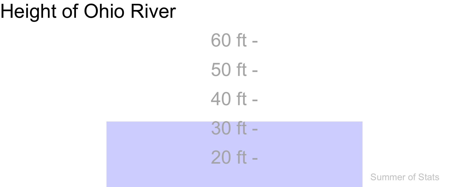
(Data source: USGS)
Keeping tabs on these ups-and-downs is undoubtedly useful - it ensures that we aren’t caught unprepared when flooding hits.
But, not all increases are meaningful.
Here, we generally don’t care about a 5ft increase in water levels - they happen all the time. But, if we are near flood stage, that 5ft increase suddenly becomes very meaningful.
In essence, just because there is an increase or decrease happening doesn’t mean there’s a problem. It all depends on how unusual that change is.
Variability in Daily Life
One practical lesson that you can take away is:
Always check the variability (
\(\sigma^2\)) of your data.
Things change constantly. However, when we start to watch this up & down change too carefully, we can find trends that aren’t actually meaningful.
If you don’t believe me, just open up the news.
Making Mountains Out of Molehills
Unfortunately, the news cycle loves picking up on small trends and turning them into a story.
The problem is that a headline rarely conveys the reality beneath the story. In many cases, a trend can be easily explainable by normal variation. Take a recent sports headline:
This development sounds important, until we see all the OTHER streaks the Diamondbacks have already had so far this season:
| Month | Streak | Type |
|---|---|---|
| April | 5 | Win |
| April | 4 | Loss |
| May | 5 | Loss |
| May | 4 | Loss |
While this trend isn’t a “lie”, it doesn’t seem quite so newsworthy on further inspection.
“Just Trust Us On This…”
Some examples are even more blatant - the following article reports on a trend they don’t even bother to quantify:
Here, the story revolves on the recent surge in tattoo removals. Strangely, they provide no data supporting this trend, not even from a single tattoo parlor.
What we’re left with is a collection of quotes from people conjecturing about why tattoo removal is so “in” right now.
To me, this represents bad journalism, and is a good example why you should always read beyond the headlines.
Summing Up
Most things in life are constantly changing. Some of them in big ways, some of them only little-by-little.
But, not every change is meaningful.
News outlets aggressively compete to be the first to find emerging trends, but they often don’t test their findings statistically. Which results in lots of compelling-sounding stories that may or may not be true.
So, whenever you are presented with a trend, always be sure to ask: “What is \(\sigma^2\)?”
Up Next: More Lying
Next week, we’ll continue discussing how people lie with statistics.
Stay tuned to see how people can engineer their sample of data to get the answer that they want.
===========================
R code used to generate plots:
- Ohio River Level
library(data.table)
library(ggplot2)
library(gganimate)

e_data <- data.table(1)
OH_river <- fread("USGS_Data.txt")
colnames(OH_river) <- c("Agency", "Site", "Date", "TZ", "Height_ft", "Other")

OH_river <- OH_river[-1,-c(1,2,4)]
OH_river[,Indx:=.I]
OH_river[,Height_ft:=as.numeric(Height_ft)]

up_down <- ggplot(OH_river, aes(x=10, y=Height_ft)) +
    theme_void() +
    coord_cartesian(xlim=c(0,20), ylim=c(10,60)) +
    ggtitle("Height of Ohio River") +
    theme(plot.title = element_text(size = 30, face = "bold")) +
    geom_bar(stat="identity", fill="blue", alpha=0.2, width=12) +
    geom_text(data = e_data, aes(x = 18, y = 11, label = "Summer of Stats"), col="grey80", size = 5) +
    geom_text(data = data.frame(y = seq(20, 60, by = 10), x = -Inf),
            aes(label = paste0(seq(20, 60, by = 10), " ft -"), y = seq(20, 60, by = 10)),
            check_overlap = TRUE,
            vjust = 1, size = 10, col="grey70") +
  transition_time(Indx)

animate(up_down, duration = 10)