
(or “Why Infinity is Your Friend”)
Let’s start today’s post with a simple question:

Pretty simple, right?
However, it really depends on who you ask…
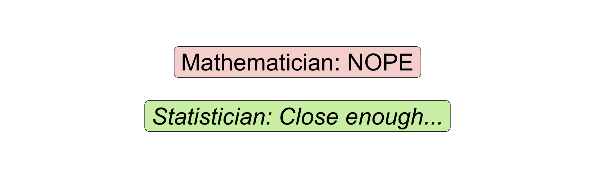
One thing I love about statisticians is their willingness to approximate.
But as with everything else with statistics, statisticians are very careful about doing things properly.
In statistics, each approximation we use has a mathematical justification, and a set of assumptions. As long as we satisfy the assumptions, our approximate answer should be very close to the real one.
Approximate This!
Let’s say you want to guess the average length for a set of books on your bookshelf.
You collect data, and assume it is from a normal population. Since you don’t know \(\sigma\) (ie. variance), your sample average will follow a t-distribution.
Unfortunately, the t-distribution can be a little tricky to work with. But, luckily for us, the t-distribution very quickly tends towards the Normal distribution, which we can calculate more easily.
We can actually illustrate this trend graphically:
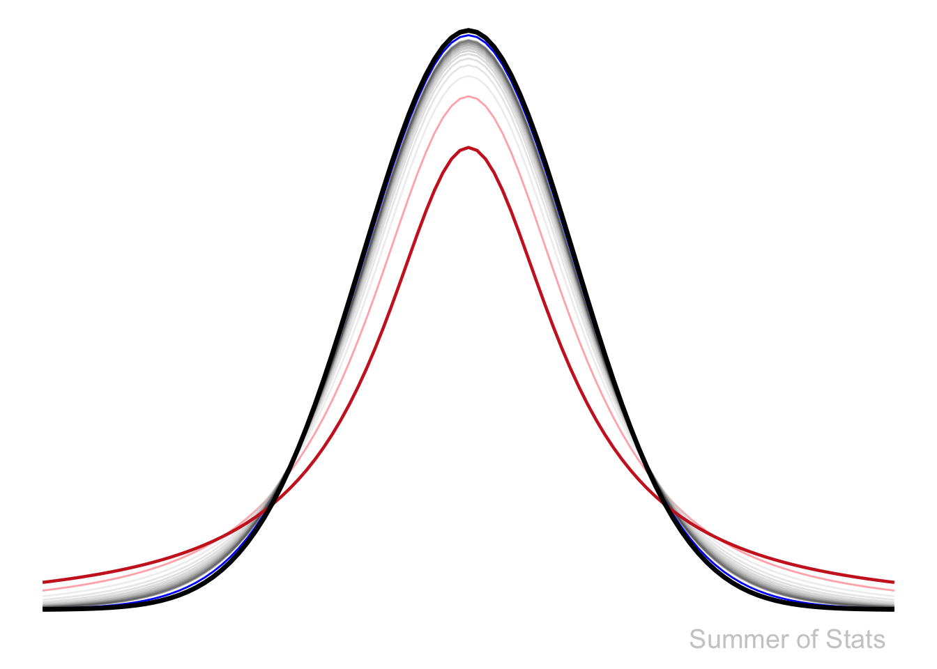
- With only 2 observations, the sampling distribution (in red) is already somewhat “Normal”-looking.
- At N=3 observations, (in light red) it jumps noticeably closer.
- N=4 through N=15 are represented by the (grey) lines. By now, there is essentially no gap with the Normal distribution.
- By the time N=30, the line (in blue) is so close that you likely can’t even distinguish it from the Normal distribution without zooming in.
Average Book Length
Let’s see how well this approximation works in action
Here, we calculate a confidence interval for average book length (exact and approximated) - Note how similar the results are once we have > 15 observations:
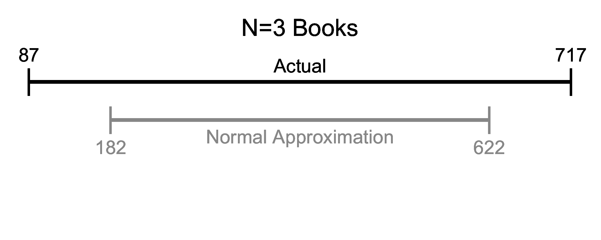


Given enough data, the results we get won’t be meaningfully different. Therefore, we can often save ourselves some effort by just using the Normal distribution to approximate things.
Approximate Everything?
The most famous approximation in all of statistics is the Central Limit Theorem.
This theorem is so famous because it shows that the Normal approximation holds for ALL distributions as sample size increases.
The only difference is how much data you need to see before things start to act “normal”, as we’ll see below.
Approximation in Daily Life
One practical lesson that you can take away is:
The guideline “N=30” is frequently misunderstood
Anyone who has taken a stats class (and survived) will tell you that data becomes “Normal” after roughly 30 observations. And isn’t this what we just saw?
No, it isn’t.
The example we saw was when data was drawn from a normal population. But not all populations are normal.
Getting it Exponentially Wrong
If our data comes from a substantially skewed population, our data will not become normal at N = 30. Consider how the following skewed distribution behaves:
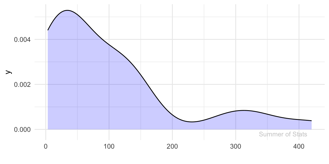
(Note - this kind of distribution is everywhere. Examples: income, housing prices, wait times, etc..)
Attempt #1 - Sample Data
Let’s see how “normal” our data gets as we gather more observations:
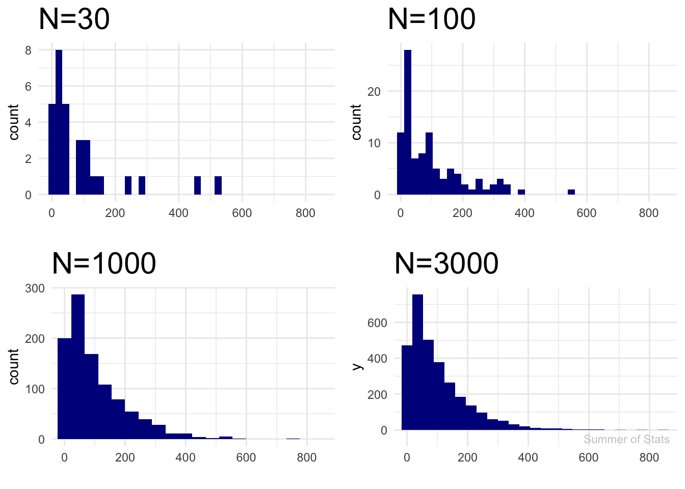
Wait, that doesn’t look “normal” at all…
Here’s why: Central Limit Theorem does not say our DATA will magically become normally distributed as our sample size increases. The data will always be right-skewed, no matter how many observation we draw.
What should become normally distributed is the AVERAGE of the sample we collect, denoted by the red line.
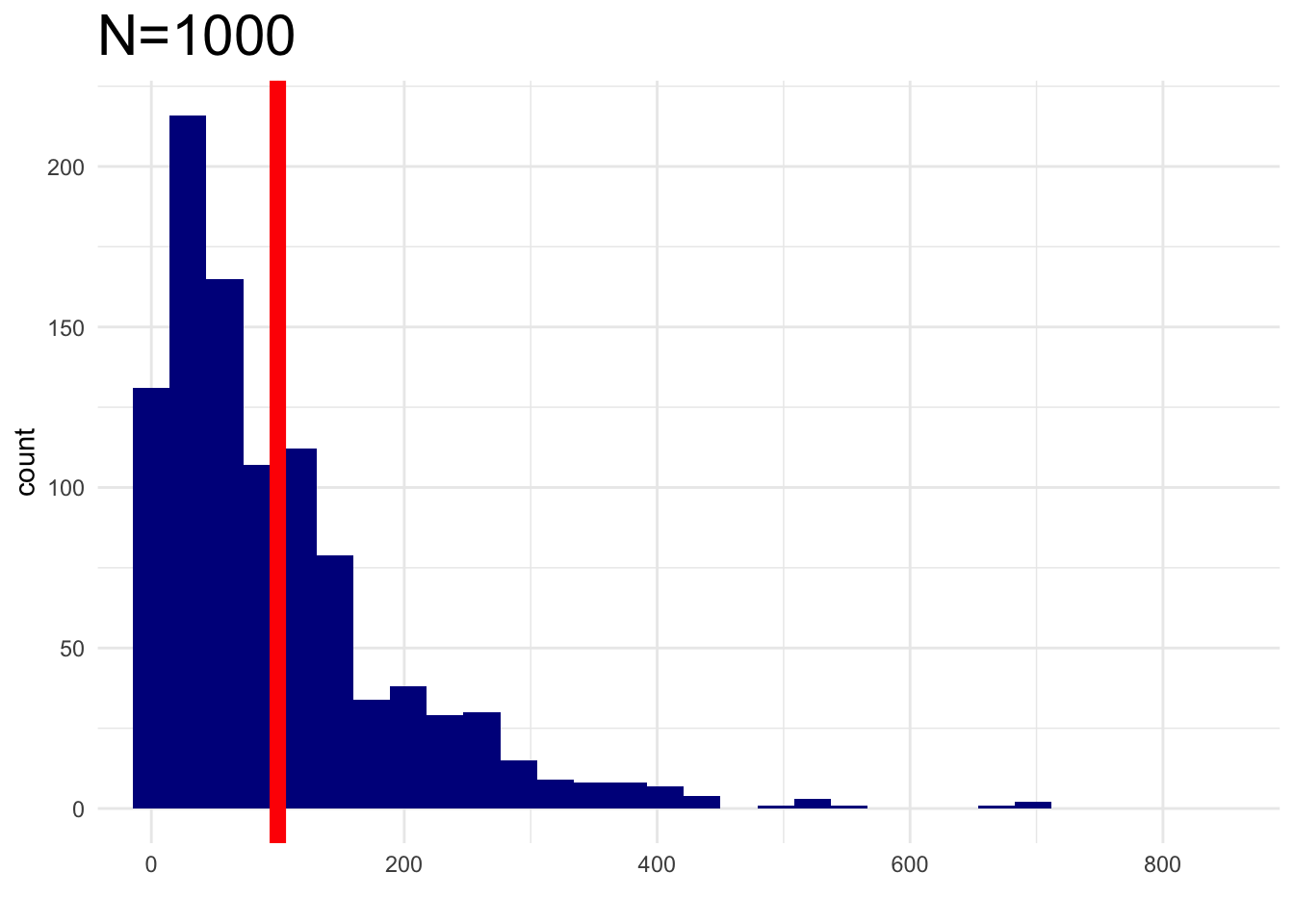
Let’s try again and see if this holds true.
Attempt #2 - Sample Mean
Now, we will plot the average value (ie. mean) of each sample:
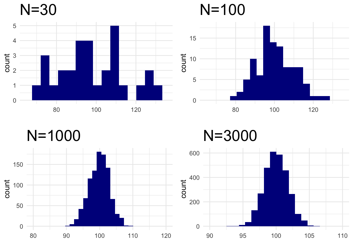
We see that the sample mean eventually does reach normality. But, it clearly does not happen at “N=30”.
Note that Central Limit Theorem does say our sample mean will eventually act “normal”. However, it doesn’t say exactly when.
(More precisely, it happens only as sample size approaches infinity.)
Summing Up
Approximations can make our lives much easier. But when used improperly, they can also lead to problems.
While many common problems will tend towards normality as more data is observed, not all of them do. This is a common mistake that can lead to very interesting miscalculations.
Use your approximations well. Otherwise, you may end up with a guess that is approximately WRONG.
Up Next: Independence
Next week, we’ll discuss the importance of independence when using statistics.
Learn how things can go very wrong when your events AREN’T independent.
===========================
R code used to generate plots:
- T-dist vs Normal
library(data.table)
library(ggplot2)

ggplot(data.frame(x = c(-4, 4)), aes(x = x)) +
    stat_function(fun = function(x) dt(x, df = 2), lwd = .5, col="firebrick1", alpha=.4) +
    stat_function(fun = function(x) dt(x, df = 3), lwd = .5, col="grey85", alpha=.4) +
    stat_function(fun = function(x) dt(x, df = 4), lwd = .5, col="grey80", alpha=.4) +
    stat_function(fun = function(x) dt(x, df = 5), lwd = .5, col="grey75", alpha=.4) +
    stat_function(fun = function(x) dt(x, df = 6), lwd = .5, col="grey70", alpha=.4) +
    stat_function(fun = function(x) dt(x, df = 7), lwd = .5, col="grey65", alpha=.4) +
    stat_function(fun = function(x) dt(x, df = 8), lwd = .5, col="grey60", alpha=.4) +
    stat_function(fun = function(x) dt(x, df = 9), lwd = .5, col="grey55", alpha=.4) +
    stat_function(fun = function(x) dt(x, df = 10), lwd = .5, col="grey50", alpha=.4) +
    stat_function(fun = function(x) dt(x, df = 11), lwd = .5, col="grey45", alpha=.4) +
    stat_function(fun = function(x) dt(x, df = 12), lwd = .5, col="grey40", alpha=.4) +
    stat_function(fun = function(x) dt(x, df = 13), lwd = .5, col="grey38", alpha=.4) +
    stat_function(fun = function(x) dt(x, df = 14), lwd = .5, col="grey35", alpha=.4) +
    stat_function(fun = function(x) dt(x, df = 15), lwd = .5, col="grey33", alpha=.4) +
    stat_function(fun = function(x) dt(x, df = 30), lwd = .5, col="blue", alpha=1) +
    stat_function(fun = function(x) dt(x, df = 1), lwd = .8, col="firebrick3") +
    stat_function(fun = dnorm, lwd = 1.2) +
    annotate("text", x = 3, y = -.02, label = "Summer of Stats", col="grey80", size = 5) +
    theme_void()
- Book Lengths
### Create sample of book lengths (in pages)
set.seed(061125)
page_length <- rnorm(50,mean=350, sd=100) |> round(0) |> as.data.table()

# 3,10,15,20,30,50
calculate_ci <- function(n, level = 0.95) {
  mu <- page_length[1:n, V1] |> mean()
  sigma <- page_length[1:n, V1] |> mean()/n

  lower_tdist <- (mu - qt(.95, n)*sigma) |> round(0)
  upper_tdist <- (mu + qt(.95, n)*sigma) |> round(0)
  lower_norm <- (mu - qnorm(.95)*sigma) |> round(0)
  upper_norm <- (mu + qnorm(.95)*sigma) |> round(0)

  return(list(lower_tdist, upper_tdist, lower_norm, upper_norm))
}


conf_int_table <- data.table(calculate_ci(3),
                             calculate_ci(10),
                             calculate_ci(15),
                             calculate_ci(20),
                             calculate_ci(30),
                             calculate_ci(50)) |> t() |> as.data.table(keep.rownames=TRUE)
conf_int_table[,rn:=c(3,10,15,20,30,50)]
colnames(conf_int_table) <- c("N", "Low (t-dist)", "High (t-dist)","Low (Normal)", "High (Normal)")

plot_range <- function(page_counts, low_t, high_t, low_norm, high_norm, labels=FALSE, N=3){

### Plot confidence interval
page_range <- ggplot(conf_int_table, aes(x=V2)) +
    geom_segment(data = conf_int_table, aes(x = low_t, xend = high_t, y = 1.35, yend = 1.35), lwd = 2) +
    geom_point(data = conf_int_table, aes(x = low_t, y = 1.35), shape = "|", size = 12) +
    geom_point(data = conf_int_table, aes(x = high_t, y = 1.35), shape = "|", size = 12) +
      geom_text(data = conf_int_table, aes(x = low_t, y = 1.55), label = low_t,size = 8) +
      geom_text(data = conf_int_table, aes(x = high_t, y = 1.55), label = high_t, size = 8) +
  {if(labels)geom_text(data = conf_int_table, aes(x = (high_t+low_t)/2, y = 1.5), label = "Actual", size = 8)}+

    geom_segment(data = conf_int_table, aes(x = low_norm, xend = high_norm, y = 1, yend = 1), lwd = 2, col="grey60") +
    geom_point(data = conf_int_table, aes(x = low_norm, y = 1), shape = "|", size = 12, col="grey60") +
    geom_point(data = conf_int_table, aes(x = high_norm, y = 1), shape = "|", size = 12, col="grey60") +
      geom_text(data = conf_int_table, aes(x = low_norm, y = 0.75), label = low_norm,size = 8, col="grey60") +
      geom_text(data = conf_int_table, aes(x = high_norm, y = 0.75), label = high_norm, size = 8, col="grey60") +
    {if(labels)geom_text(data = conf_int_table, aes(x = (high_norm+low_norm)/2, y = 0.85), label = "Normal Approximation", size = 8, col="grey60")} +

    geom_text(data = conf_int_table, aes(x = (high_t+low_t)/2, y = 1.85), label = paste0("N=",N), size = 10) +
    coord_cartesian(ylim = c(0,2), xlim = c(85, 720)) +
    theme_void()

page_range
}

plot_range(conf_int_table, 87,717,182,622,labels=TRUE, N="3 Books")
plot_range(conf_int_table, 307,443,313,437, N=10)
plot_range(conf_int_table, 329,416,332,413, N=15)
plot_range(conf_int_table, 336,376,337,376, N=30)
- Exponential Normality
library(gridExtra)

set.seed(061125)
s_data <- rexp(rate=0.01, n=30) |> as.data.table()
ggplot(s_data, aes(x=V1)) + geom_density(fill="blue", alpha = 0.2) + theme_minimal() + xlab("") +
      annotate("text", x = 375, y = -.0002, label = "Summer of Stats", col="grey80", size = 3)


### Sample data points
make_plot <- function(n_obs) {
  plot_title <- paste0("N=",n_obs)
  s_data <- sapply(1:n_obs, function(X) {rexp(rate=0.01, n=n_obs)}) |> as.data.table()
  ggplot(s_data, aes(x=V1)) + geom_histogram(bins=25, fill="darkblue") + theme_minimal() + xlab("") + labs(title=plot_title) + theme(plot.title = element_text(size=22)) + coord_cartesian(xlim = c(0,850))
}

grid.arrange(make_plot(30), make_plot(100),
             make_plot(1000), make_plot(3000) + annotate("text", x = 725, y = -50, label = "Summer of Stats", col="grey80", size = 3),
             nrow=2, ncol=2)


### Mean
make_plot(1000) + geom_vline(xintercept = 100, col="red", lwd = 3)

### Sample means
make_plot <- function(n_obs, x_low, x_high) {
  plot_title <- paste0("N=",n_obs)
s_data <- sapply(1:n_obs, function(X) {rexp(rate=0.01, n=n_obs) |> sum()/n_obs}) |> as.data.table()
  ggplot(s_data, aes(x=V1)) + geom_histogram(bins=15, fill="darkblue") + theme_minimal() + xlab("") + labs(title=plot_title) +
    theme(plot.title = element_text(size=22)) + coord_cartesian(xlim = c(x_low, x_high))
}

grid.arrange(make_plot(30, 65, 135), make_plot(100, 65, 135),
             make_plot(1000, 80,120), make_plot(3000,90,110),
             nrow=2, ncol=2)