
(or “Why Being Normal is Overrated”)
We all know what happens when you assume.

However, assumptions are not necessarily a bad thing.
For example: when I see a traffic light that is green, I assume that nobody will come barreling through the intersection. This assumption allows me to drive predictably and safely.
The same is true with guessing - many common questions would simply be impossible to answer without assumptions.
An Impossible Problem
Concerts season is upon us, which means that tons of exciting shows will be coming to town.
However, when you go to a show, there’s always a chance your view will look like this:

So, it might be interesting to estimate - “What is the probability that my view will be blocked at a given show?”
This is a tricky problem: you don’t know who will be standing in front of you. So, how would we estimate this?
A Probablitistic Assumption
In short, we can simplify things by making assumptions.
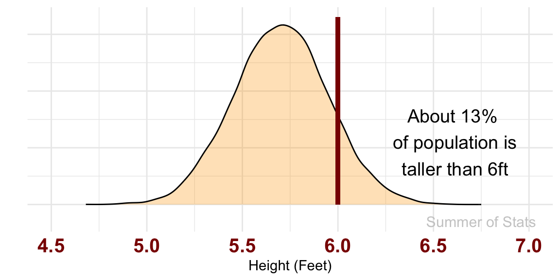
Here, we simply assume that the person in front of you is chosen at random from within the US population. So, our probability can come directly from the normal distribution. That is not so hard to calculate!
For someone who is 6 feet tall, the odds that the person in front of you is TALLER comes out to roughly 13%:
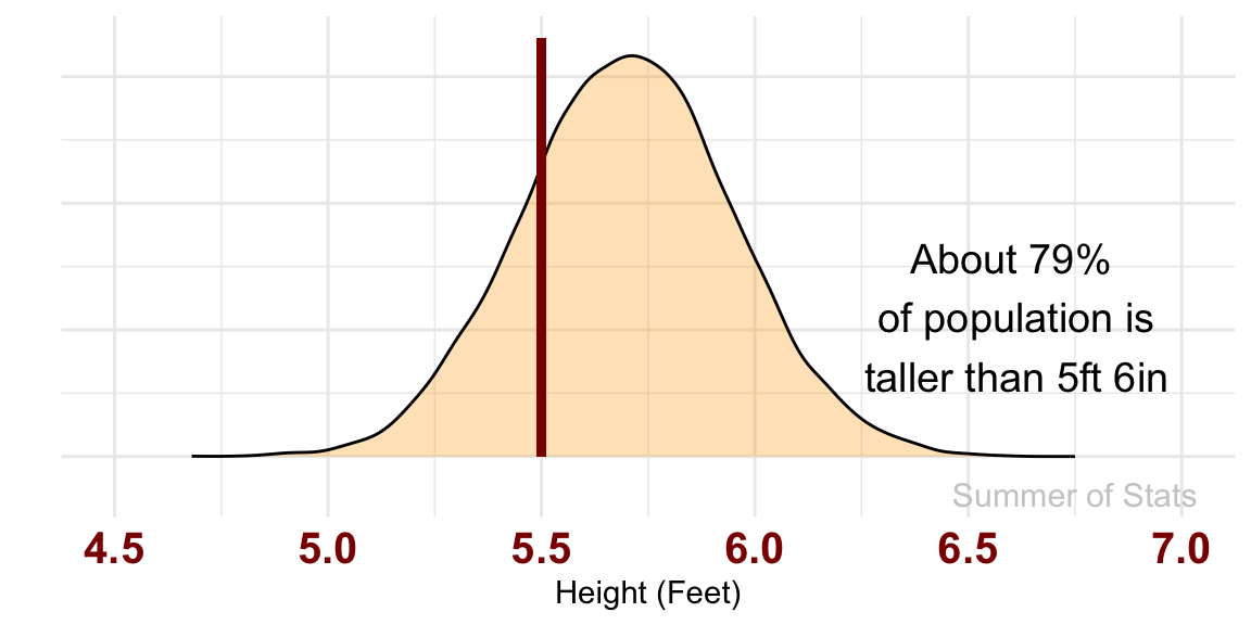
However, if you are shorter (say 5'6"), things don’t look quite so great:
Obviously, we could make our model much better by refining these assumptions, but this initial rule-of-thumb has given us the tools to make a reasonable guess about a hard-to-measure problem.
But, not all assumptions are created equal, as we’ll see below.
Assumptions in Daily Life
One practical lesson that you can take away is:
Don’t just assume your data is Normal
As we discussed, there is nothing inherently wrong with making assumptions. However, the trouble begins when your assumptions don’t correspond with reality.
Most often, people often run into this problem when they blindly assume their data is normally distributed.
Get Me to the Airport, Part 2
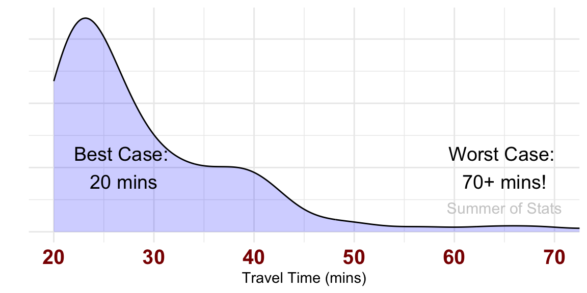
Last week, we modeled travel time to the local airport.
In our model, we assumed that traffic was exponentially distributed based on prior expert research. Our travel time model looked something like this:
But what if we modeled traffic as normally distributed instead?
We’d end up with some seriously weird traffic.
When “Normal” Isn’t Normal
The first thing we’d notice is the shape of our distribution changes noticeably. All skewness quickly disappears, and we get the familiar bell-shaped curve.
We also see hints that there may be a problem though - our model now tells us that some trips are completed in “negative” time:
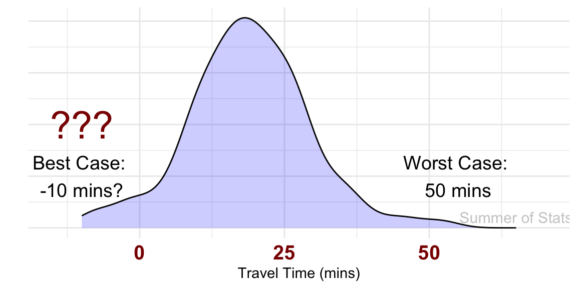
Ruh-roh! What went wrong here?
Models vs. Reality
The issue is that our model assumptions were wrong.
| NORMAL Model | Reality |
|---|---|
| Travel times can be positive or negative | Travel times can only be positive |
| Traffic can slow you down OR speed you up. | Traffic can only slow you down |
In contrast, the assumptions of the exponential distribution are a much closer to how traffic actually behaves:
| EXPONENTIAL Model | Reality |
|---|---|
| Travel times can only be positive | Travel times can only be positive |
| Traffic can only slow you down | Traffic can only slow you down |
As a result, the exponential model yields a much more realistic guesses.
Summing Up
Assumptions are a useful tool in many situations.
While assumptions can simplify complex issues and make analytical work more manageable, they’re not a substitute for reality. If your assumptions are bad, your model is bad. Period.
Be especially careful when using the normal distribution. The normal distribution is nice for assuming away many complications, but it will not work everywhere. Use the assumption of normality wisely.
Remember: assumptions may you help get an answer, but they won’t check that the answer makes sense. That’s your job!
Up Next: Approximation
Next week, we make assumptions SO big, they go to infinity.
Learn how statistical approximations can save us from the drudgery of difficult math.
===========================
R code used to generate plots:
- Going to a Concert
library(ggplot2)
library(data.table)

set.seed(060425)

### Good old normal distribution
heights <- rnorm(10000,5.7,.25) |> as.data.table()

base_plot <- ggplot(heights, aes(x=V1)) +
    geom_density(fill="orange", alpha=0.3) +
    theme_minimal() + xlab("Height (Feet)") + ylab("") + theme(axis.text.y=element_blank()) +
    theme(axis.text.x = element_text(face="bold", color="darkred", size=15)) +
    coord_cartesian(xlim=c(4.5,7)) +
    annotate("text", x = 6.75, y = -.15, label = "Summer of Stats", col="grey80", size = 4)

over_6 <- heights[V1>=6]
base_plot +
    geom_segment(aes(x=6, y=1.65, xend=6, yend=0), color='darkred', lwd=1.5) +
    annotate("text", x = 6.6, y = .55, label = "About 13.25%\n of population is\n taller than 6ft", size = 5)


over_5.5 <- heights[V1>=5.5]

base_plot +
    geom_segment(aes(x=5.5, y=1.65, xend=5.5, yend=0), color='darkred', lwd=1.5) +
    annotate("text", x = 6.6, y = .55, label = "About 79%\n of population is\n taller than 5ft 6in", size = 5)
- Normal Traffic Modeling
library(ggplot2)
library(data.table)

set.seed(052825)

# Model traffic for each route
# (Traffic ONLY adds to travel time - sorry guys!)
I_71_traffic <- rexp(100,1/10)

# Do 100 simulated drives
I_71 <- 20 + I_71_traffic

### Compare trip times
ggplot(as.data.table(I_71), aes(x=I_71)) +
    geom_density(fill="blue", alpha=.2) +
    coord_cartesian(xlim=c(20,70)) +
    theme_minimal() + xlab("") + ylab("") + theme(axis.text.y=element_blank()) +
    annotate("text", x = 27, y = .01, label = "Best Case: \n20 mins", size = 5) +
    annotate("text", x = 65, y = .02, label = "Worst Case: \n70+ mins!", size = 5) +
    annotate("text", x = 65, y = .0075, label = "Summer of Stats", col="grey80", size = 4)

# Model traffic for each route using NORMAL distribution
I_71_traffic <- rnorm(100,mean=20,sd=10)

### Compare trip times
ggplot(as.data.table(I_71_traffic), aes(x=I_71_traffic)) +
    geom_density(fill="blue", alpha=.2) +
    coord_cartesian(xlim=c(0,70)) +
    theme_minimal() + xlab("") + ylab("") + theme(axis.text.y=element_blank()) +
    annotate("text", x = 10, y = .0075, label = "Best Case: \n-10 mins?", size = 5) +
    annotate("text", x = 55, y = .01, label = "Worst Case: \n60 mins", size = 5) +
    annotate("text", x = 65, y = .002, label = "Summer of Stats", col="grey80", size = 4)