(or “Why You Should Always Prepare Extra Food”)
After seeing last week how quickly a small sample of data can arrive at the “correct” answer, we’re probably feeling pretty good!
But, our sample estimate is just that, an estimate. And, it’s not perfect.
In many cases, it’s important to know HOW certain we are of that estimate. To do this, we use a confidence interval.
What is a Confidence Interval?
A confidence interval is the range of estimates that could be plausible, given your sample. After all, it makes sense that we’d be more confident after 50 observations than we are after seeing only 5.
A Visual Explanation
Recall how sampling allows us to make estimates about a larger population - as we add observations, our sample estimate gradually “hones in” on the true value (assuming a good random sample):
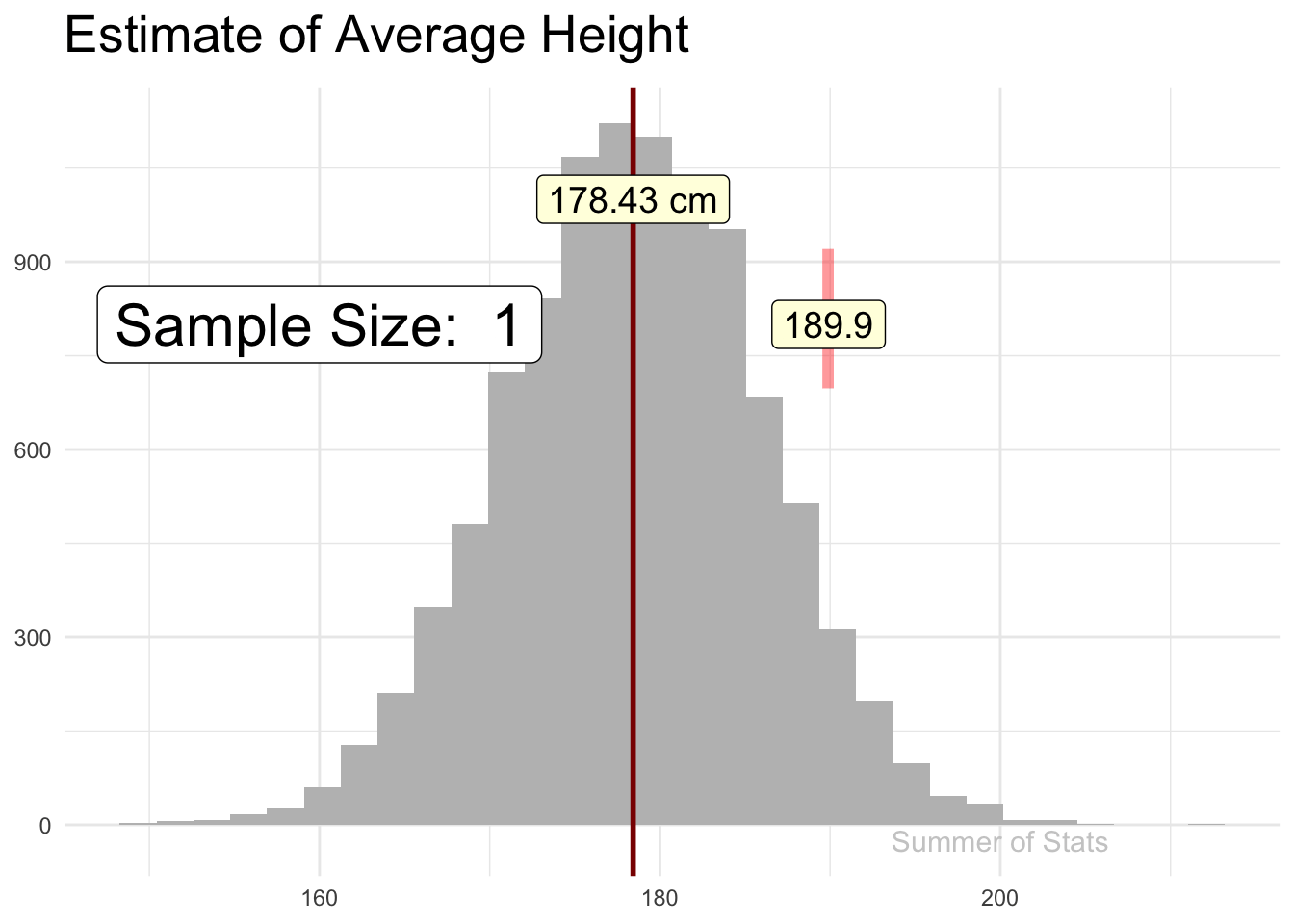
The line “jitters” around, showing that there is some uncertainty in the estimate, but this uncertainty gets smaller & smaller as our sample gets bigger.
If we explicitly plotted out our confidence interval (at 99% confidence), we’d see that our confidence interval becomes tighter as we add more observations.
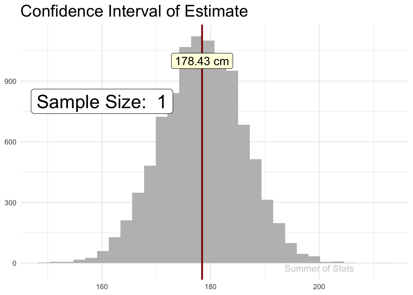 However, the rate of improvement quickly dies off. Pretty soon, each additional data point does very little to increase our confidence.
An Alternate Take
If we held our animation still, and drew out each confidence interval as our sample size increases, it would look a bit like a tornado. Notice how our interval never really “closes” - there is always some level of uncertainty as to the exact value:
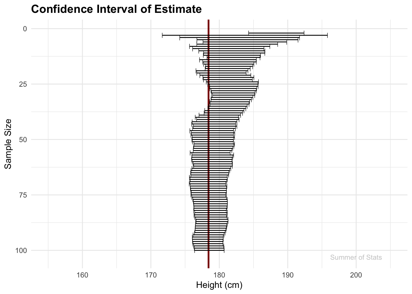
Clearly, the estimate gets better as the sample size increases, but we will always end up with a range of values we have to consider, and throwing in more observations won’t really do much to fix that.
And this is a good thing! Our confidence interval prevents us from being overly confident in our single point estimate. It’s entirely possible our particular sample slightly over/underestimated, and our confidence band gently reminds us that our answer isn’t perfect.
Confidence Intervals in Daily Life
One practical lesson of confidence intervals that you can take away is:
Always prepare for a RANGE of possibilities.
If you’ve ever planned a party, you should already be familiar with this idea.
Planning a Party
Let’s say I want to throw a summer cook-out. To ensure there’s enough food for everyone, I need to have a solid count of how many people will attend.
Very likely, when you review your RSVP list, you mentally categorize everyone into “Yes”/“No”/“Maybe”.
If we only considered the responses we’re certain about (“Yes”), we’re very likely to run out of food. Not a good outcome!
“Well, the hamburgers WERE right here…”
Instead, we should consider a range of possible attendees. And because it’s better to have too much food than too little, it’s probably best to assume ALL of our “Maybes” will attend too, to get the “high” end of our estimate:
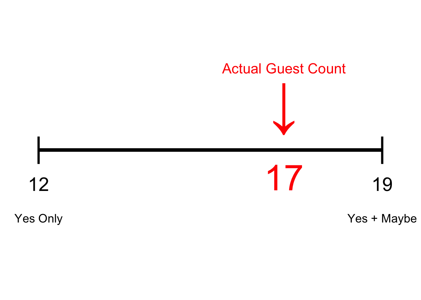
While it didn’t require a ton of complex math to arrive at it, our range did successfully inform us on how many attendees to expect. And, ensuring everyone is fed and has a good time is always a good thing!
Summing Up
Even when you’ve done your homework, you’ll still have unknowns you’ll need to contend with.
People tend to forget that everything has a range of possibilities. This mindset can easily set you up for failure - especially when you’re hosting a party!
Next week, we’ll use the idea of constructing a range of likely values to test our assumptions. To do this, we’ll introduce Hypothesis Testing. See you then!
===========================
R code used to generate plots:
- Confidence Interval (Animated and non-animated)
library(data.table)
library(ggplot2)
library(gganimate)
set.seed(060124)

### Generate 10000 sample height records, using mean = 178.4, std = 7.59
simulated_pop <- cbind(1:10000, rnorm(10000, 178.4, 7.59)) |> as.data.table()
simulated_mean <- simulated_pop[,mean(V2)] |> as.data.table()

### Pull a random sample
good_sample <- simulated_pop[sample(.N,100)]

# Add calculations for cumulative mean
good_sample <- good_sample[,cum_V2 := cumsum(V2)]
good_sample <- good_sample[,Row_Index := .I]
good_sample <- good_sample[,cum_avg_V2 := cum_V2/Row_Index]
good_sample <- good_sample[,cum_sd := vapply(seq_along(V2), function(i) sd(V2[1:i]), 1)]
good_sample <- good_sample[,conf_upper:= cum_avg_V2 + 2.58 * cum_sd/sqrt(Row_Index)]
good_sample <- good_sample[,conf_lower:= cum_avg_V2 - 2.58 * cum_sd/sqrt(Row_Index)]


### Plot confidence interval
good_sample_convergence <- ggplot(good_sample, aes(x=V2)) +
  geom_histogram(data = simulated_pop, aes(x=V2), fill="grey", position = "identity") +
    theme_minimal() +
      theme(axis.title.y=element_blank(),
            axis.title.x=element_blank(),
            axis.ticks.x=element_blank(),
            plot.title = element_text(size = 20, face = "bold")) +
    ggtitle("Confidence Interval of Estimate") +
    geom_vline( xintercept = simulated_pop[,mean(V2)], lwd = 1, col = "darkred")  +
  geom_label(data = simulated_mean, aes(x = V1, y = 1000, label = paste0(round(V1, digits = 2), " cm") ), size = 5, fill = "lightyellow") +
    geom_segment(data = good_sample, aes(x = conf_lower, xend = conf_upper,
                   y = 810, yend = 810), size = 1.4) +
  geom_point(data = good_sample, aes(x = conf_lower, y = 810), shape = "|", size = 7) +
  geom_point(data = good_sample, aes(x = conf_upper, y = 810), shape = "|", size = 7) +
  #geom_point(data = good_sample, mapping = aes(y = 810, x = cum_avg_V2),                size = 20, color = 'red', shape = '|', alpha = .4) +
      geom_label(data = good_sample, aes(x = 160, y = 800, label = paste("Sample Size: ", Row_Index)), size = 8, fill = "white") +
      geom_text(data = simulated_mean, aes(x = 200, y = -25, label = "Summer of Stats"), col="grey80", size = 4) +
 transition_reveal(Row_Index, keep_last = FALSE)

animate(good_sample_convergence, duration = 8,end_pause = 30)

### Tornado Plot
tornado_plot <- ggplot(good_sample, aes(x=V2)) +
    ggtitle("Confidence Interval of Estimate") +
    geom_vline( xintercept = simulated_pop[,mean(V2)], lwd = 1, col = "darkred")  +
    geom_segment(data = good_sample, aes(x = conf_lower, xend = conf_upper,
                   y = Row_Index, yend = Row_Index)) +
  geom_point(data = good_sample, aes(x = conf_lower, y = Row_Index), shape = "|", size = 2) +
  geom_point(data = good_sample, aes(x = conf_upper, y = Row_Index), shape = "|", size = 2) +
  #geom_point(data = good_sample, mapping = aes(y = Row_Index, x = cum_avg_V2),                size = 1.5, color = 'red', shape = '|', alpha = .9) +
      geom_text(data = simulated_mean, aes(x = 200, y = 103, label = "Summer of Stats"), col="grey80", size = 3) +
  coord_cartesian(xlim = c(155, 205)) +
  scale_y_reverse() +
  theme_minimal() +
  theme(axis.ticks.x=element_blank(),
            plot.title = element_text(size = 14, face = "bold")) +
  ylab("Sample Size") +
  xlab("Height (cm)")

tornado_plot
- RSVP Range
library(data.table)
library(ggplot2)

### Count our RSVPs
rsvp_counts <- cbind(12, 5, 7)  |> as.data.table()
setnames(rsvp_counts, c("Yes", "No", "Maybe"))

### Plot confidence interval
rsvp_range <- ggplot(rsvp_counts, aes(x=V2)) +
    geom_segment(data = rsvp_counts, aes(x = Yes, xend = Yes + Maybe,
                   y = 1, yend = 1), lwd = 2) +
    geom_point(data = rsvp_counts, aes(x = Yes, y = 1), shape = "|", size = 12) +
    geom_point(data = rsvp_counts, aes(x = Yes + Maybe, y = 1), shape = "|", size = 12) +
    geom_point(data = rsvp_counts, aes(x = 17, y = 1.3), shape = "↓", size = 25, color = "red") +
      geom_text(data = rsvp_counts, aes(x = 12, y = 0.75), label = "12",size = 8) +
      geom_text(data = rsvp_counts, aes(x = 19, y = 0.75), label = "19", size = 8) +
      geom_text(data = rsvp_counts, aes(x = 12, y = 0.5), label = "Yes Only", size = 5) +
      geom_text(data = rsvp_counts, aes(x = 19, y = 0.5), label = "Yes + Maybe", size = 5) +
      geom_text(data = rsvp_counts, aes(x = 17, y = 0.8), label = "17", color = "red", size = 15) +
      geom_text(data = rsvp_counts, aes(x = 17, y = 1.6), label = "Actual Guest Count",size = 6, color = "red") +
  coord_cartesian(ylim = c(0,2), xlim = c(11.6, 19.4)) +
    theme_void()

rsvp_range