(or “Why It Pays to Have a Clipboard”)
Oftentimes, we want to know something about a very large group.
For example, someone might want to know how tall the average male is in the United States. How would we answer a question like this?

“We’re gonna need some more measuring tape…”
Fortunately for us, there is an approach that will allow us to answer this seemingly impossible question: sampling.
What is Sampling?
Sampling is a technique that allows us estimate a measure of interest without having to collect data from every single individual.
By collecting data from a small group that represents the population (this is critical, as we’ll see), we can get a reasonably accurate result with only a handful of observations.
Here, we’ll attempt to estimate how tall an average male is by randomly picking and measuring a sample of 100 men. Notice how quickly the sample jumps to the actual population mean:
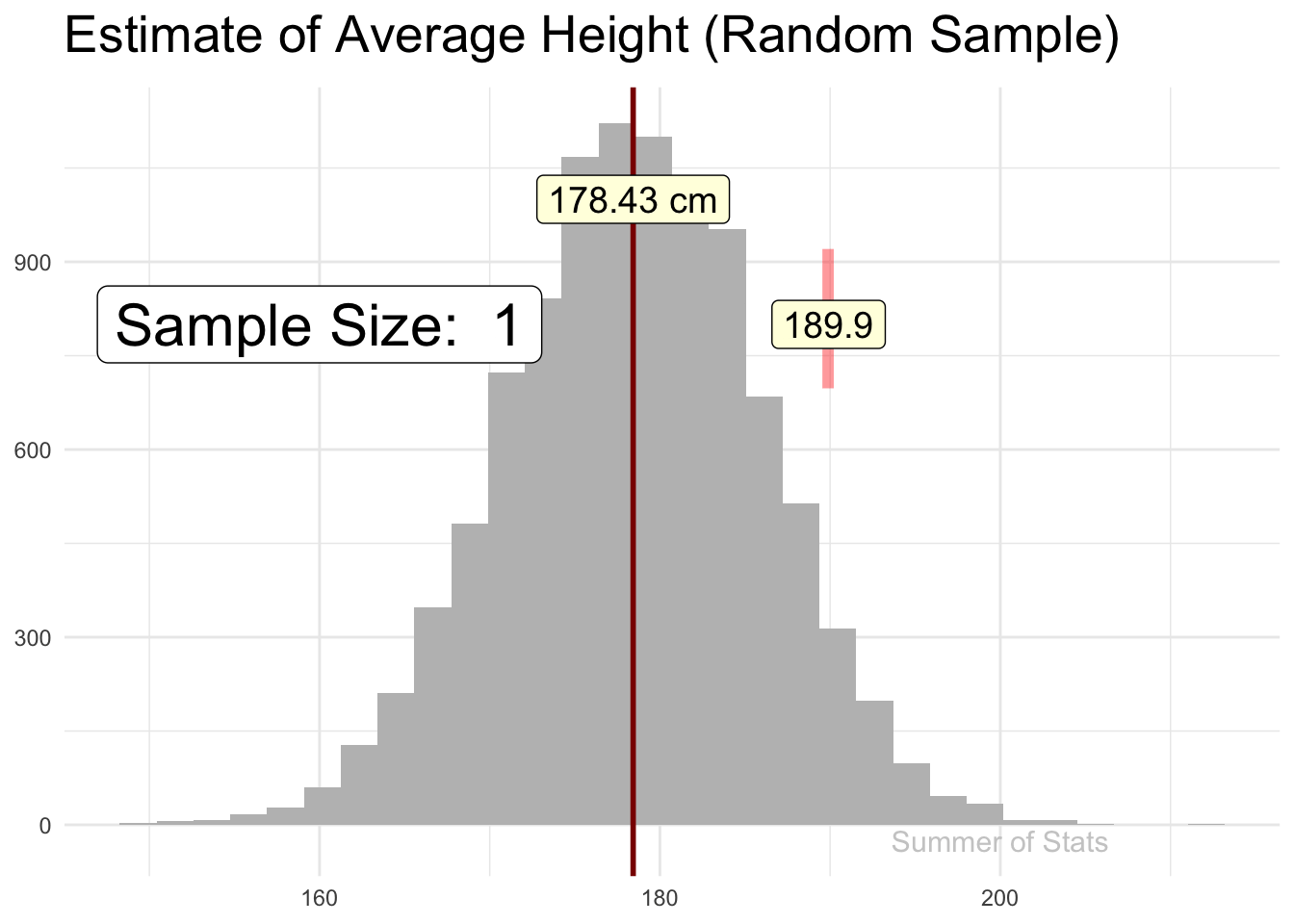
(Note: 178cm is roughly 5’ 10")
The Perils of a Bad Sample
Recall that our sample must represent the population. What this means is that if we do a poor job of picking our respondents, our results will be biased.
Let’s say that we decided to collect our sample of heights at a local basketball tournament. Because basketball players tend to be taller, we see that our sample DOES NOT yield a good height estimate for an average male.
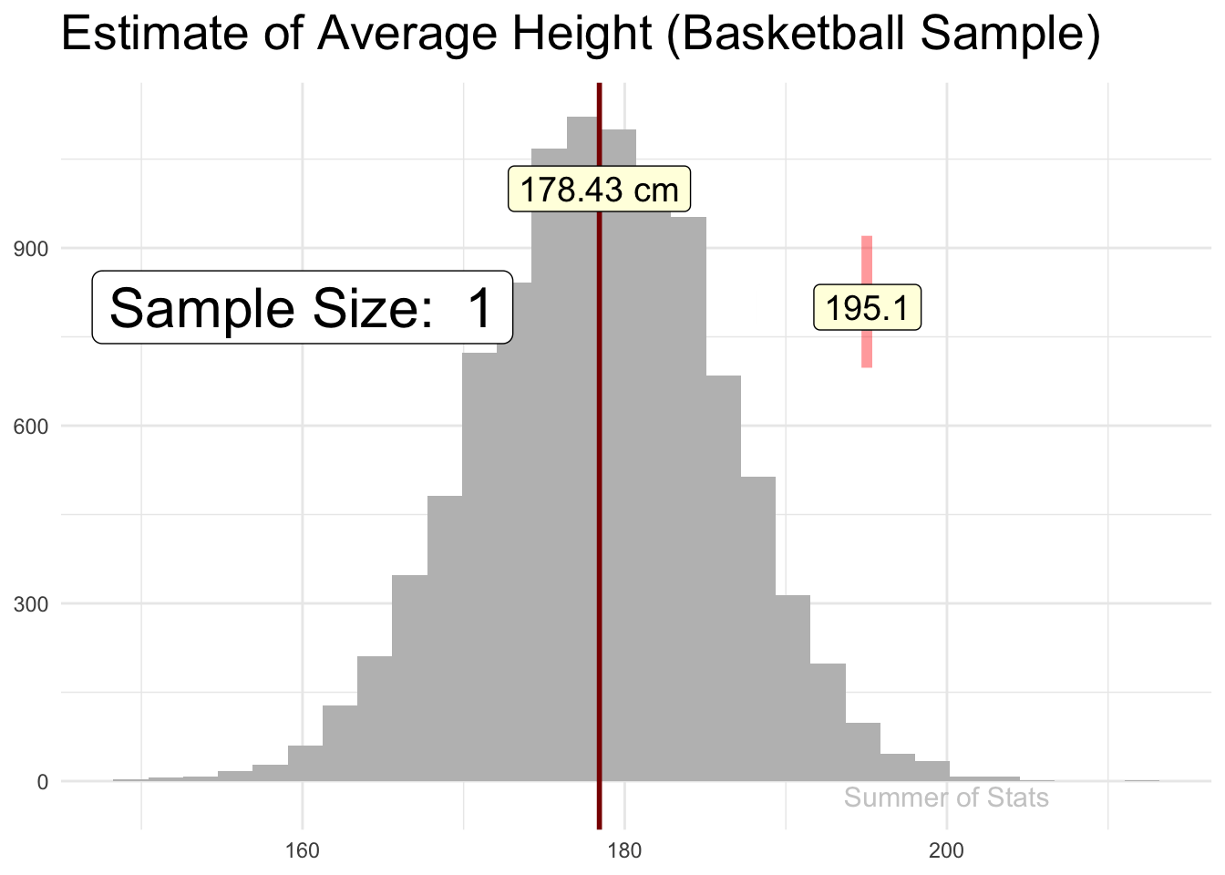
(Note: 191cm is roughly 6’ 3")
Even worse, no matter how many more basketball players we sample, our estimate will not get any better.
This is because our sample is not representative of all males, a problem called selection bias. Ensuring you don’t fall into this trap is often the most difficult part of sampling. Just ask the Chicago Daily Tribune!
Sampling in Daily Life
One practical lesson of sampling that you can take away is:
MORE data ≠ BETTER data.
As we saw with our “bad” sample, when our data is no good, it doesn’t matter how many more rows of data we add into the mix. Our results are going to be biased.
The Question - “Is Our Building Big Enough?”
Let’s consider a practical example: your company is growing, rapidly. Facilities wants to know if more desk spaces are needed at the office.
This question will require us to estimate how full the office is on any given day.
There are actually quite a few ways we could attempt tackle this, using existing data:
- Go to HR to get a count of all employees.
- Grab data from your company’s desk reservation system.
- Siphon data from the on-site badge-reader.
- Set up an AI-branded camera system to track your worker’s every move*
* Just kidding, don’t do this
Great! Let’s get started…
The Issue - Analyzing the Data
No matter how we approach things, getting a reliable estimate from these existing data sources will quickly become complicated:
- Using HR data: We may have people who are WFH, either full-time or on a hybrid schedule. How we count them?
- Using desk reservations: Reservations aren’t perfect - people may “squat” at an unoccupied desk, or reserve a desk “defensively”, even though they aren’t using it.
- Using badge-reader: People arrive throughout the day, and may move around the office (ie. not need a desk space)
So, how do we use this noisy data to get a good estimate of desk usage at the office?
The Solution - A Clipboard
An easy (and cheap) solution to this problem could be to collect a sample.
Doing so would be easy - have an intern take a 15 minute walk of the floor at various times of the day, and use a clipboard to note how many empty desks there are.
If done thoughtfully, this sample of data will provide a much more reliable estimate of your current office capacity, with much less analysis headache.

An intern with a clipboard can be a far better data source than a multi-million dollar transactional system…
By collecting a high-quality sample of data, you side-step all of complications and biases that your noisy transactional data brings with it.
A Common Trap - Repurposing Existing Data
The MORE = BETTER problem pops up commonly in analytics projects. Often, the data that is already laying around in your database is where people start: It’s easy to access. There’s lots of it.
Unfortunately, this data is also likely to not tailored to the problem being analyzed. And, much like a bad sample, these poor measures can lead us astray if we rely on them.
As an analyst, you should always aim to directly measure what you’re interested in, even if you have to do it manually.
Summing Up
Done correctly, sampling is an incredibly useful approach for answering questions. However, this powerful tool also demands accountability.
If you are sloppy with what you collect or how you collect it, your analysis will suffer, no matter how many rows of data you have.
Next week, we’ll discuss how confident we can be in the results of our sample, using Confidence Intervals. See you then!
===========================
R code used to generate plots:
- Animated Plots
library(data.table)
library(ggplot2)
library(gganimate)
set.seed(060124)

### Generate 10000 sample height records, using mean = 178.4, std = 7.59
simulated_pop <- cbind(1:10000, rnorm(10000, 178.4, 7.59)) |> as.data.table()
simulated_mean <- simulated_pop[,mean(V2)] |> as.data.table()

### Pull a random sample
good_sample <- simulated_pop[sample(.N,100)]

# Add calculations for cumulative mean
good_sample <- good_sample[,cum_V2 := cumsum(V2)]
good_sample <- good_sample[,Row_Index := .I]
good_sample <- good_sample[,cum_avg_V2 := cum_V2/Row_Index]


### Pull a non-random sample from a basketball league
# (assume these people all are in top 10% for height...)
bad_sample <- simulated_pop[V2 > quantile(simulated_pop$V2, probs = .90)][sample(.N,100)]

# Add calculations for cumulative mean
bad_sample <- bad_sample[,cum_V2 := cumsum(V2)]
bad_sample <- bad_sample[,Row_Index := .I]
bad_sample <- bad_sample[,cum_avg_V2 := cum_V2/Row_Index]


### Plot good sample
good_sample_convergence <- ggplot(good_sample, aes(x=V2)) +
  geom_histogram(data = simulated_pop, aes(x=V2), fill="grey", position = "identity") +
    theme_minimal() +
      theme(axis.title.y=element_blank(),
            axis.title.x=element_blank(),
            axis.ticks.x=element_blank(),
            plot.title = element_text(size = 20, face = "bold")) +
    ggtitle("Estimate of Average Height (Random Sample)") +
  geom_vline( xintercept = simulated_pop[,mean(V2)], lwd = 1, col = "darkred")  +
  geom_label(data = simulated_mean, aes(x = V1, y = 1000, label = paste0(round(V1, digits = 2), " cm") ), size = 5, fill = "lightyellow") +
    geom_point(data = good_sample, mapping = aes(y = 810, x = cum_avg_V2),
               size = 20, color = 'red', shape = '|', alpha = .4) +
  geom_label(data = good_sample, aes(x = cum_avg_V2, y = 800, label = round(cum_avg_V2, digits = 1)), size = 5, fill = "lightyellow") +
      geom_label(data = good_sample, aes(x = 160, y = 800, label = paste("Sample Size: ", Row_Index)), size = 8, fill = "white") +
      geom_text(data = simulated_mean, aes(x = 200, y = -25, label = "Summer of Stats"), col="grey80", size = 4) +
 transition_reveal(Row_Index, keep_last = FALSE)

animate(good_sample_convergence, duration = 8,end_pause = 30)


### Plot bad sample
bad_sample_convergence <- ggplot(bad_sample, aes(x=V2)) +
  geom_histogram(data = simulated_pop, aes(x=V2), fill="grey", position = "identity") +
    theme_minimal() +
      theme(axis.title.y=element_blank(),
            axis.title.x=element_blank(),
            axis.ticks.x=element_blank(),
            plot.title = element_text(size = 20, face = "bold")) +
    ggtitle("Estimate of Average Height (Basketball Sample)") +
    geom_vline( xintercept = simulated_pop[,mean(V2)], lwd = 1, col = "darkred")  +
  geom_label(data = simulated_mean, aes(x = V1, y = 1000, label = paste0(round(V1, digits = 2), " cm") ), size = 5, fill = "lightyellow") +
    geom_point(data = bad_sample, mapping = aes(y = 810, x = cum_avg_V2),
               size = 20, color = 'red', shape = '|', alpha = .4) +
  geom_label(data = bad_sample, aes(x = cum_avg_V2, y = 800, label = round(cum_avg_V2, digits = 1)), size = 5, fill = "lightyellow") +
      geom_label(data = bad_sample, aes(x = 160, y = 800, label = paste("Sample Size: ", Row_Index)), size = 8, fill = "white") +
      geom_text(data = simulated_mean, aes(x = 200, y = -25, label = "Summer of Stats"), col="grey80", size = 4) +
 transition_reveal(Row_Index, keep_last = FALSE)

animate(bad_sample_convergence, duration = 8,end_pause = 30)