(or “Stop and Measure the Flowers”)
Whenever someone thinks about statistics, the first image that comes to mind probably looks something like this:
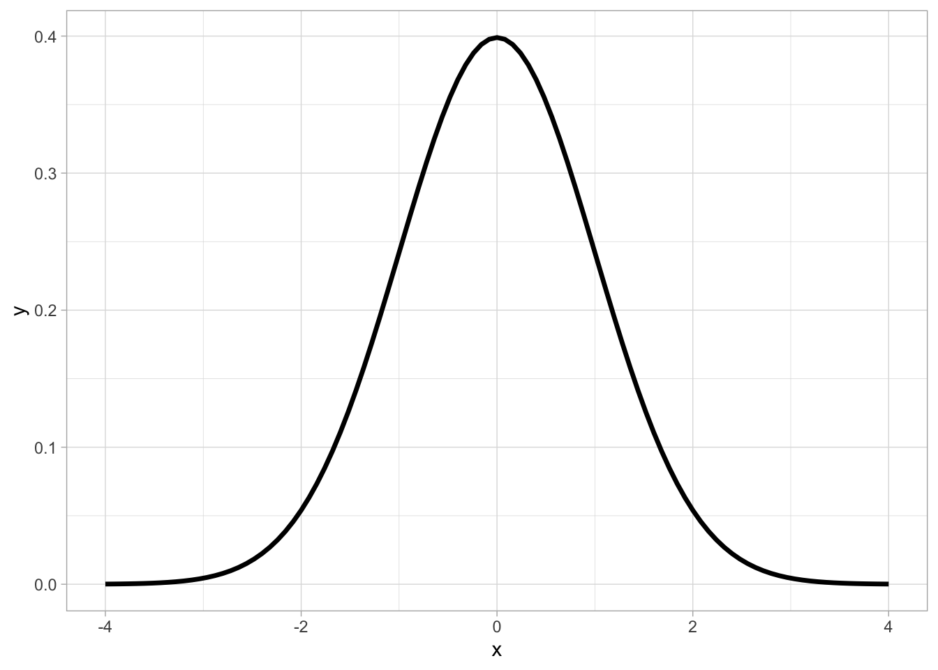
Ah, the normal curve!
This is the probability distribution we have all seen or at least heard of. But what does it tell us, exactly?
What is a Probability Distribution?
We have previously discussed what probability is (the likelihood of an outcome occurring). A probability distribution describes how likely ALL outcomes are.
For example, in the normal distribution, the shape of the curve shows us that the most likely outcomes cluster around a single point (the mean), and taper off as we go further from this central value:
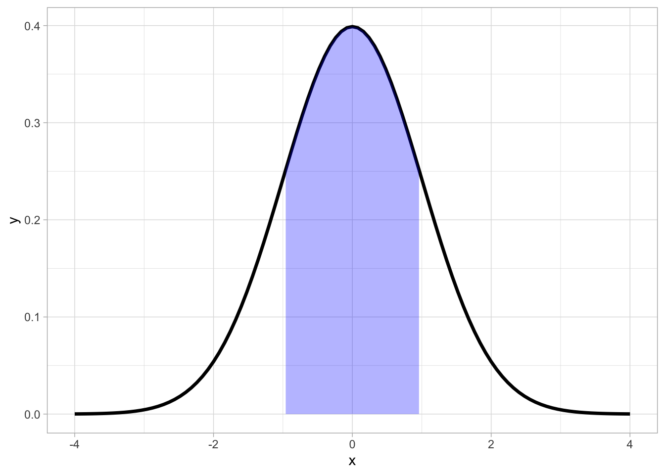
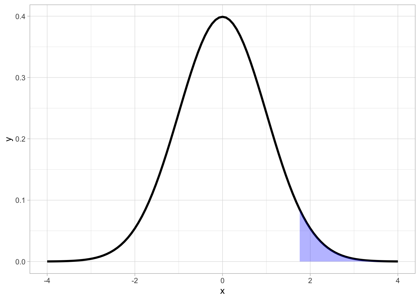
Extreme outcomes have very little probability associated with them, meaning that they are not all that likely to occur:
But there are many other distributions we could use. For example, the Uniform distribution:
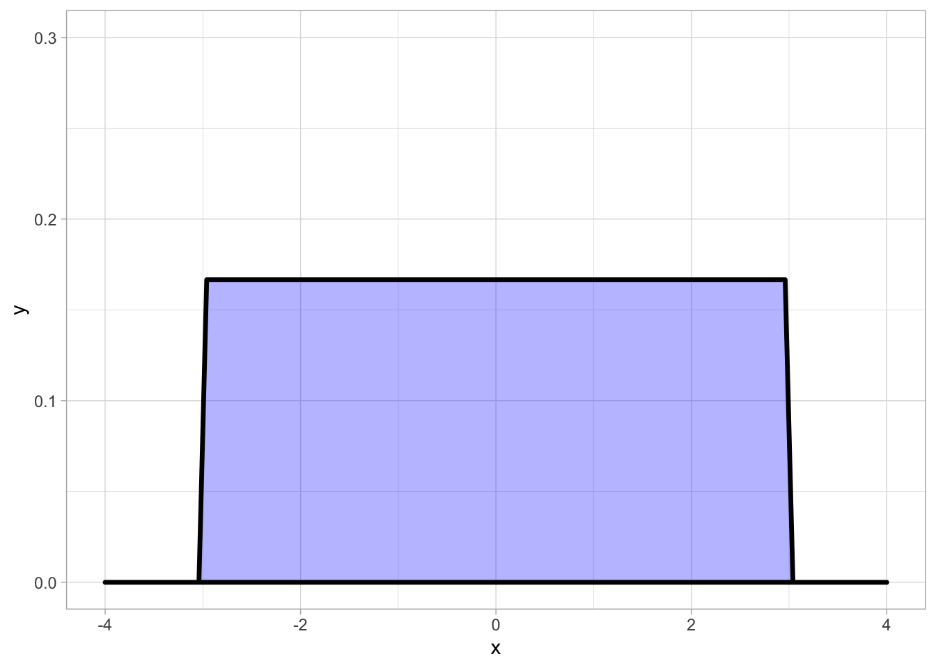
In a Uniform distribution, there is no central point and every outcome is equally likely, giving it a distinctive “blocky” shape.
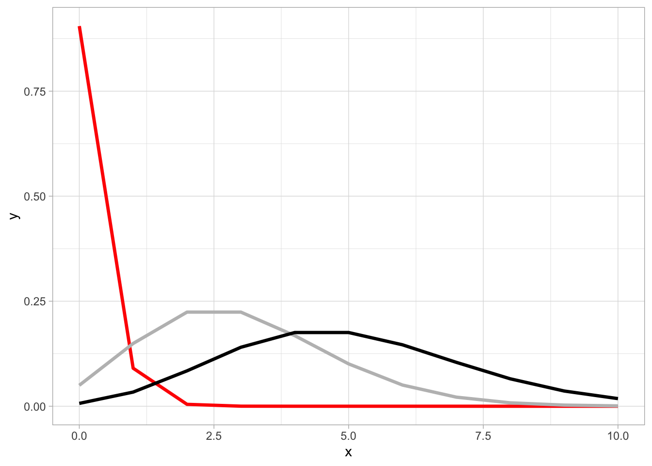
Or here’s the Poisson distribution, whose shape morphs based on the parameter (λ) used to generate it.
(We could keep going, but I’ll stop here, as this would be an entire course on its own!)
Probability Distributions in Daily Life
One practical lesson about probability distributions that you can take away is:
HOW you decide to group things can hugely impact your results.
Most any real-world dataset is likely to include distinct sub-groups. How you handle these groups can have a huge impact on your analysis.
Let’s pick some flowers…
Assume I pick a huge bundle of flowers out of my garden. Being a nerd, I’m interested in seeing how BIG my flowers are. Here is the distribution of how long the flower petals are:
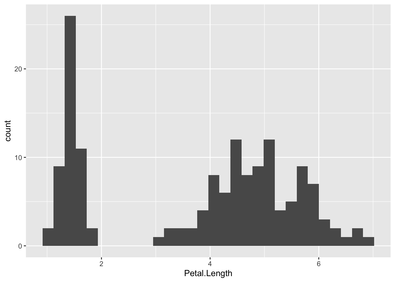
Our data does not follow the nice “bell curve” we have seen up to this point. Instead, our distribution is multi-modal (having multiple peaks, instead of just 1).
What this implies is that we might have multiple groups (possibly different flower types) in our data. While this is not inherently wrong, it can wreak havoc in some unexpected ways.
When Mixing Groups Goes Wrong
Let’s find the average flower size:
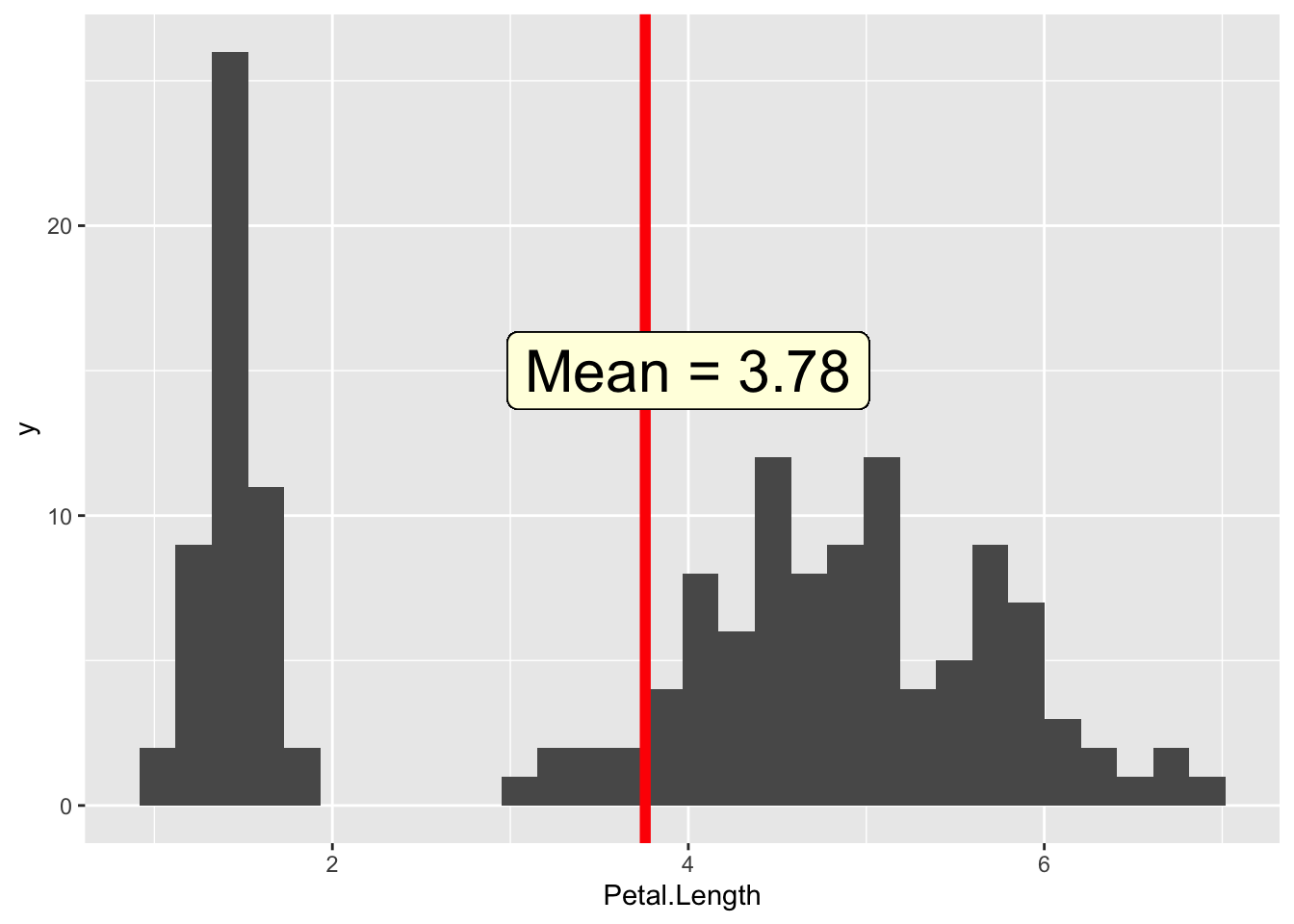 As we can see, this value IS our average, but it doesn't correspond particularly well with any of the flowers we actually saw.
(If we checked our median and standard deviation, they wouldn’t make a lot of sense either.)
One way to solve this is to create separate distributions for each segment. Now, each distribution looks “normal” again. Phew!
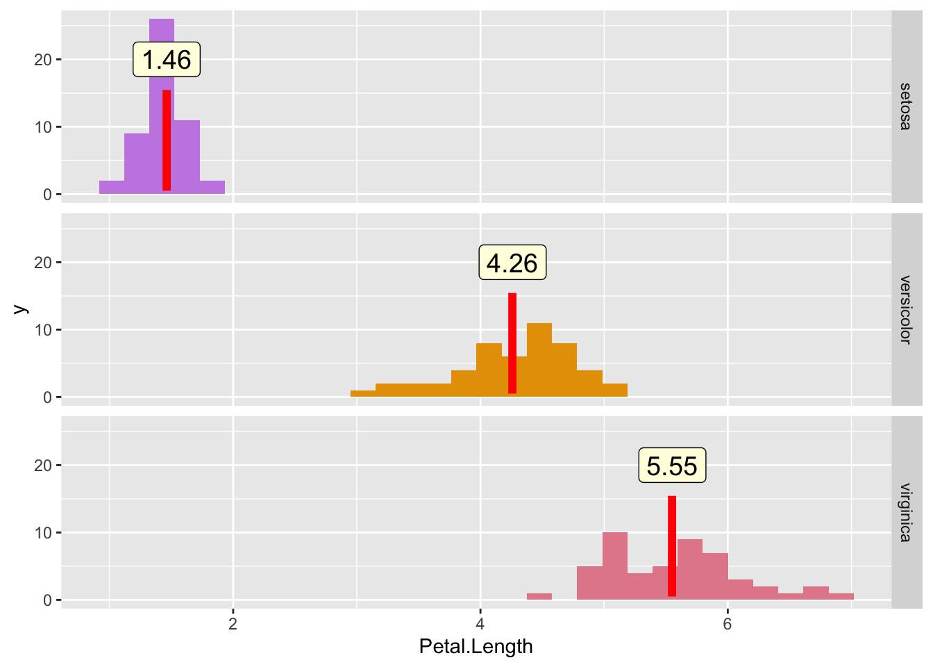 We also see that our summary statistics now make a lot more sense.
When in Doubt, Split it Out
Chances are, your dataset will contain multiple groups that behave differently. As we saw above, without considering our sub-groups, the results we generated did not describe anything particularly useful.
While you may ultimately elect to combine groups together, it is important that you observe how each looks separately, so that you do not group unlike things together, and end up mis-representing your data.
For further reading on how sub-groups can impact your results in some very surprising ways, check out this article on Simpson’s paradox.
Summing Up
Probability distributions are extremely useful for assessing what outcomes are likely to occur.
Not only do we end up with a tool for calculating probabilities, we also see the underlying structure of what at first glance appears to be a random, chaotic system.
And it’s beautiful.

This is what excites me about statistics, and why I can’t wait to continue learning more.
If you feel the same way, join me next week as we cover a very useful technique that lets us “do more with less” - sampling!
===========================
R code used to generate plots:
- Probability Distributions
library(ggplot2)

### Good old normal distribution
norm_dist_plot <- ggplot(data.frame(x = c(-4, 4)), aes(x = x)) +
    stat_function(fun = dnorm, lwd = 1.2) +
    theme_light()

norm_dist_plot

### Shading function, to limit the range of our function for plotting
funcShaded <- function(x, lower_bound, upper_bound) {
    y = dnorm(x)
    y[x < lower_bound] <- NA
    y[x > upper_bound] <- NA
    return(y)
}

### Middle shaded
shade_middle <- norm_dist_plot +
    stat_function(fun = funcShaded, args = list(lower_bound = -1, upper_bound = 1), geom = "area", fill = "blue", alpha = .3)

shade_middle


### Tail shaded
shade_tail <- norm_dist_plot +
    stat_function(fun = funcShaded, args = list(lower_bound = 1.75, upper_bound = 10000), geom = "area", fill = "blue", alpha = .3)

shade_tail


### Uniform Distribution
uniform_dist <- ggplot(data.frame(x = c(-4, 4)), aes(x = x)) +
    stat_function(fun = dunif, lwd = 1.2, args = list(-3, 3),geom = "polygon", col= "black", fill = "blue", alpha = 0.3) +
    scale_y_continuous(limits = c(0, 0.3)) +
    theme_light()

uniform_dist


### Poisson Distribution
poisson_dist <- ggplot() +
    geom_line(data = transform(data.frame(x=c(0:10)), y=dpois(x, .1)), aes(x, y), stat="identity", col = "red", lwd = 1.2) +
    geom_line(data = transform(data.frame(x=c(0:10)), y=dpois(x, 3)), aes(x, y), col = "grey", lwd = 1.2) +
    geom_line(data = transform(data.frame(x=c(0:10)), y=dpois(x, 5)), aes(x, y), lwd = 1.2) +
  theme_light()

poisson_dist
- Flower Example
library(data.table)
library(ggplot2)

### Mixed distribution
flower_data <- as.data.table(iris)
mixed_distribution <- ggplot(flower_data, aes(x=Petal.Length)) +
    geom_histogram(bins = 30)

mixed_distribution

### Plot average
avg_length <- flower_data[,mean(Petal.Length)]

mixed_distribution +
  geom_vline( xintercept = avg_length, lwd = 2, col = "red") +
  geom_label(aes(x = 4, y = 15, label = "Mean = 3.78"), size = 8, fill = "lightyellow")

### Split up Species
group_means <- flower_data[,mean(Petal.Length), by = "Species"]

split_distributions <- ggplot(flower_data, aes(x=Petal.Length, fill = Species)) +
  geom_histogram(bins = 30)  +
  facet_grid(Species ~ .) +
  guides(fill="none") +
  scale_fill_manual(values=c("#c78ae4", "#E69F00", "#e48a9b")) +
  geom_point(data = group_means, mapping = aes(y = 8, x = V1),
               size = 20, color = 'red', shape = '|') +
  geom_label(data = group_means, aes(x = V1, y = 20, label = round(V1,digits =2)), size = 5, fill = "lightyellow")